Jello & Mellow

A Magical Hideaway
Nestled in a transformed industrial district, Jello & Mellow is a vibrant playhouse cafe in Taikoo. This bustling spot attracts families and workers seeking diverse dining options. Committed to the local community, Jello & Mellow offers warm service, flavorful cuisine, and recreational facilities, creating a welcoming retreat for those wanting to escape the city's hustle and fostering meaningful connections through fun activities for kids.
House of Forme worked with the client on their brand naming, concept, visual identity and branding collateral.


Boundless Imagination.
Inspired by Nordic aesthetics that highlight airy spaces, natural light, and clean lines, the playhouse design blends indoor and outdoor motifs in a spacious setting. It serves as a magical escape from the city's chaos, allowing children to explore while parents enjoy authentic food with family and friends. The name “Jello & Mellow” is memorable and reflects the brand’s playful, welcoming image, symbolising a place filled with possibilities and imagination where everyone can feel comfortable and relaxed. With "J & M" representing the initials of the founder's twins, it adds a personal touch that enriches the brand's connection.
Drawing inspiration from jello—a sweet, bouncy dessert that embodies versatility and imagination—the concept of “A Boundless Fantasy” invites you into a world where possibilities are endless, whether you’re in a playful space, a bakery creating delicious treats, or a relaxing cafe. Jello & Mellow fosters community, encouraging unique expressions of fun and creativity. Celebrating the softness and diverse forms of jello, our concept emphasises inclusivity and the limitless potential of this simple dessert, creating a cohesive space that invites boundless imagination.


Shapes of Joy.
Jello & Mellow’s identity system draws on the fluidity and shapes of jelly. With organic carrier shapes as the main visual element, the brand communicates a flexible and cohesive space.
The logotype features organic, rounded details that reflect the jiggliness and squishiness of jello, while the slight imbalance in the “O” and the spring-like “E” adds to the brand’s playful character. The combination of the letters J and M forms a heart-shaped logomark, beautifully capturing the brand’s lively personality.


Spark Playful Connections.
Jello & Mellow’s brand fonts feature a round sans-serif style, offering a minimal yet contemporary aesthetic. This is complemented by a distinctive italic script font that embodies the brand's playful yet relaxed ethos.
Inspiration is drawn from a variety of flavours and jello moulds, resulting in secondary graphics and a colour palette that are vibrant and whimsical. Diverse shapes are used to delineate different areas within the space. A lively pastel palette beautifully contrasts with a solid blue inspired by the interior, creating a harmonious balance between tranquillity and playfulness. The soft hues and dynamic shapes reflect the brand's spirited character, inviting guests to immerse themselves in a delightful and engaging environment.
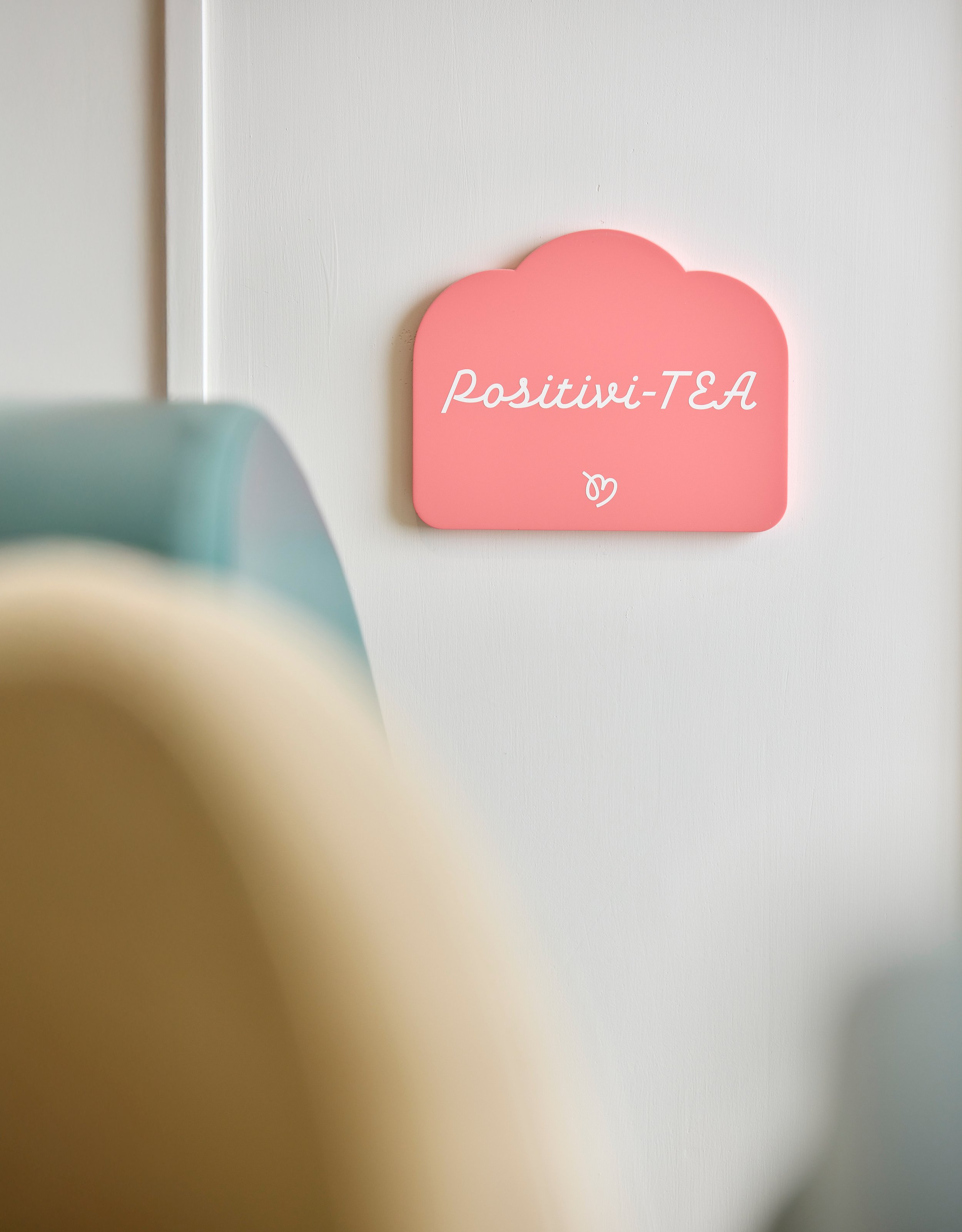
Every detail has been meticulously curated, from tableware to menus and packaging. Playful elements, such as chunky, round cups and fridge-inspired menus, along with customisable digital Instagram templates featuring a variety of shapes, lines, and colours, have been thoughtfully incorporated. The environment is further enhanced with varied signage and floor graphics, transforming Jello & Mellow into a gateway to an enchanting experience. This careful design approach not only highlights the joy of dining but also fosters a sense of community and connection among families, ensuring that every visit becomes a memorable adventure.


Moment
2024
Industry
Education, Gastronomy
Credits
Food Photography- J&M
