Communicate Your Brand Story Through Signage and Wayfinding.
Signage and wayfinding are integral parts of our daily lives. It’s on the streets we drive on, office buildings we work in, to every shop and restaurant we visit on a day-to-day basis. It is also a crucial part of any commercial interior design exercise, as it offers brands an opportunity to create more awareness, and most importantly, to convey their story.
Signage aids in orienting us in a space, whereas wayfinding directs us to the destinations of our choice. Another kind of signage is what we refer to as "brand environments”, which is a special arrangement of visual components that come together in a design to create a distinctive moment in a space.
Here are a few examples of different sign types and how a strong signage system can help communicate a brand's story, serve as a placemaking tool, and strengthen a sense of place.
Brand Signage Design - A Reflection of Your Identity.
Brand signages are extensions of a physical space and are also a reflection of a brand’s unique personality. Oftentimes, branders and architects overlook the significance of brand signage design because it falls under both categories. Typically, branders are more concerned with the strategy and design of the brand, whereas architects are more concerned with the spatial experience of the space. In our opinion, signage design is one of the most significant touchpoints a business can have, and should be carefully evaluated and given top priority during the design process.
For example, the facade signage we designed for Ken’s Watches is both informative and impactful. A reflection of the vibrant and bustling neighbourhood of Wan Chai’s red light district, the shop’s bespoke linear neon sign with pegged lettering pays tribute to the environment it inhabits.
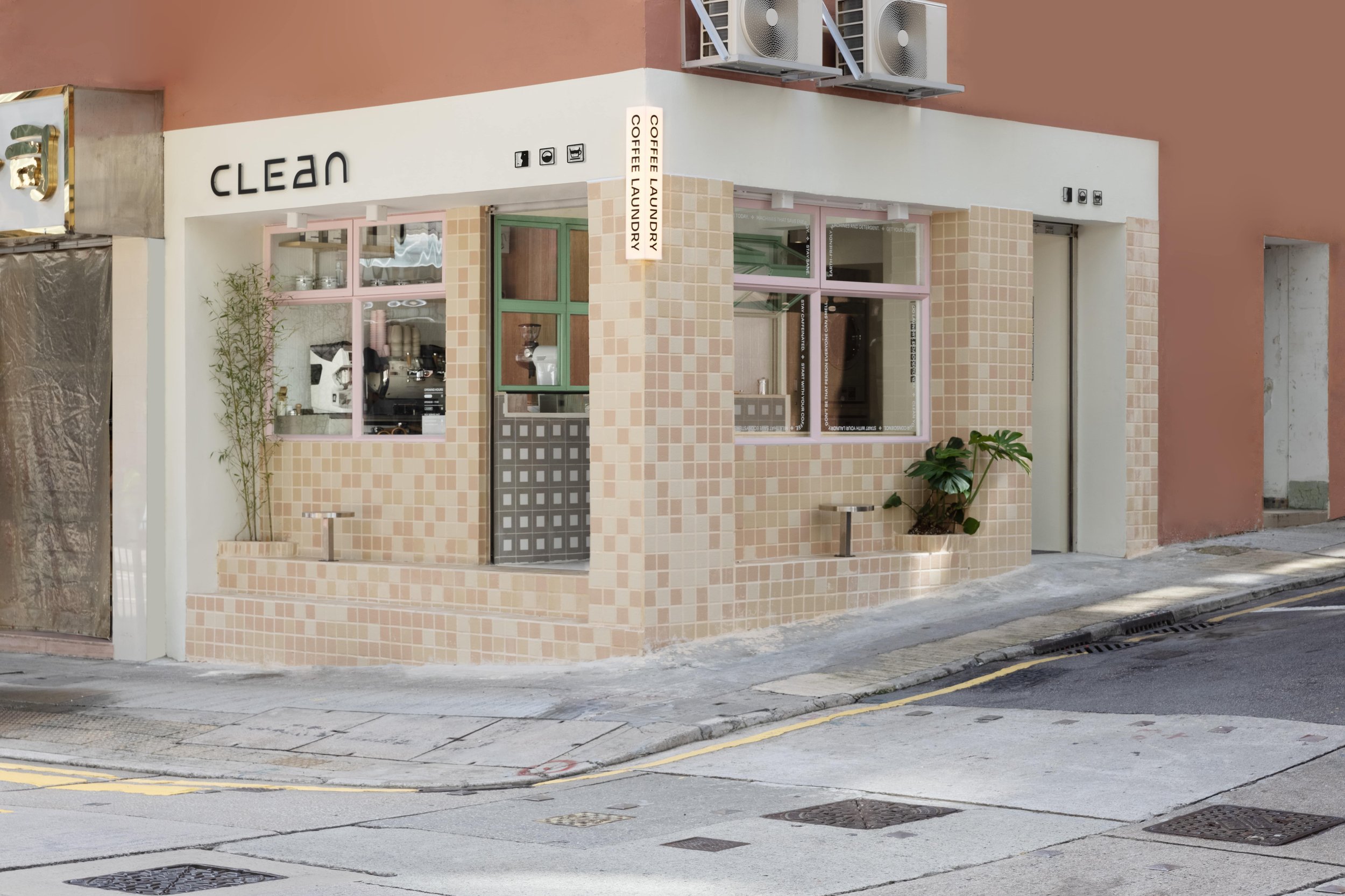
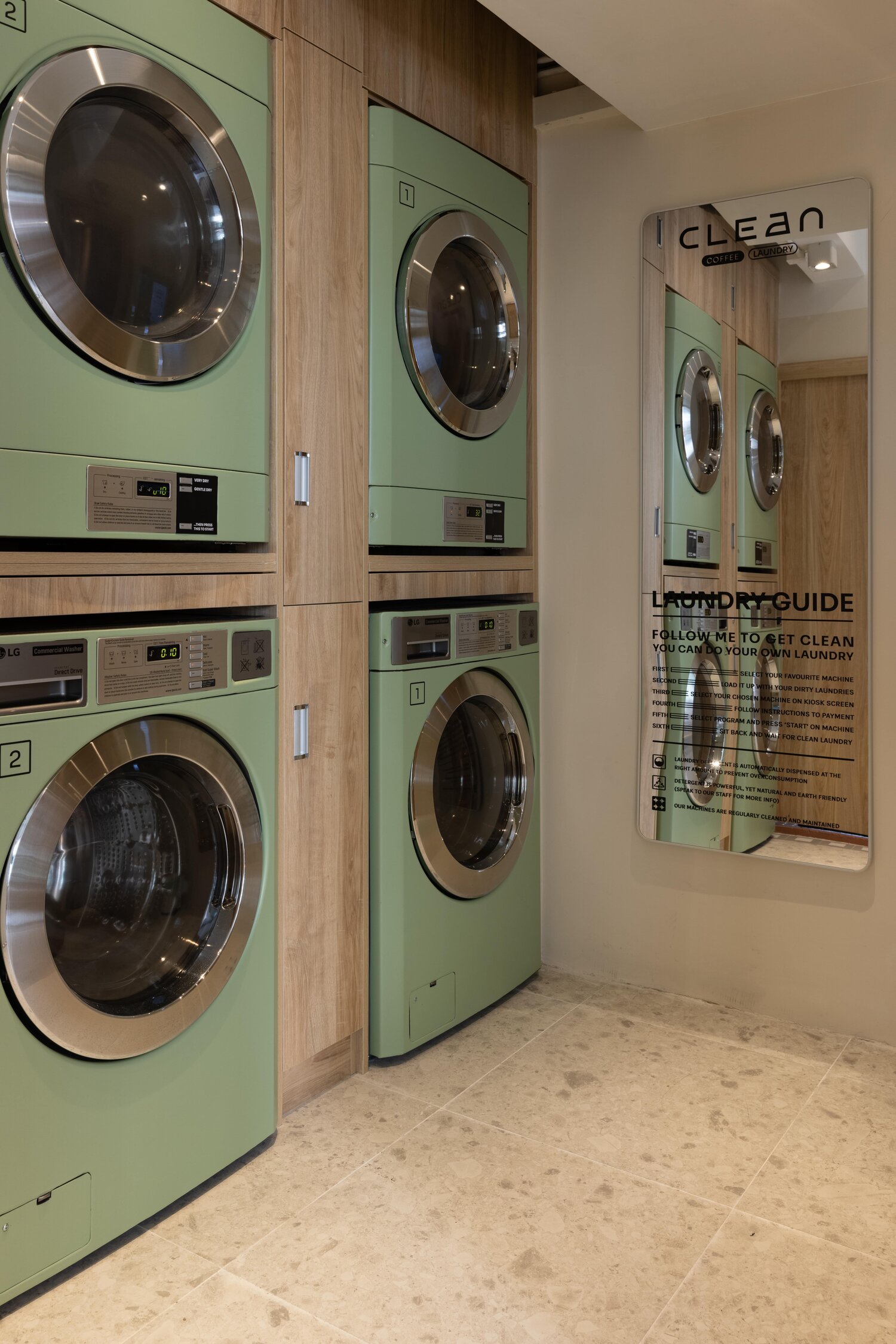
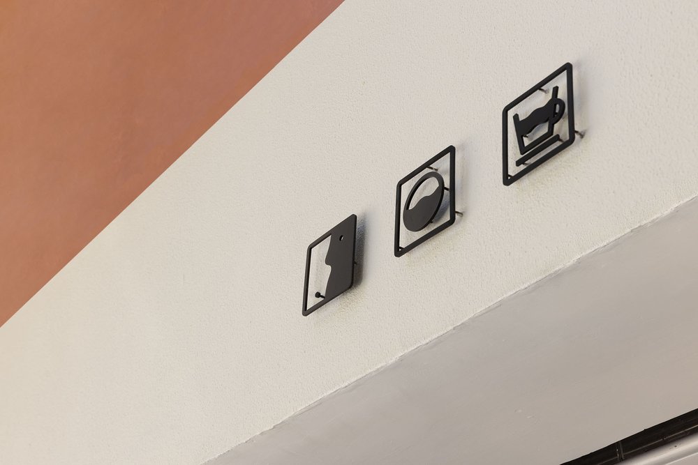
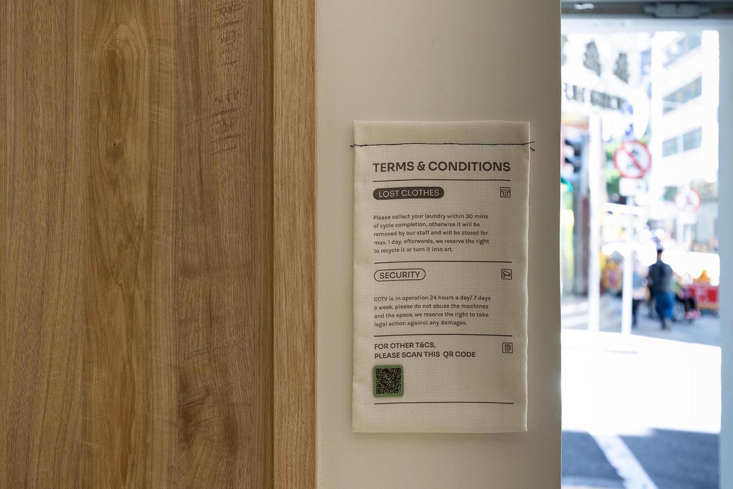
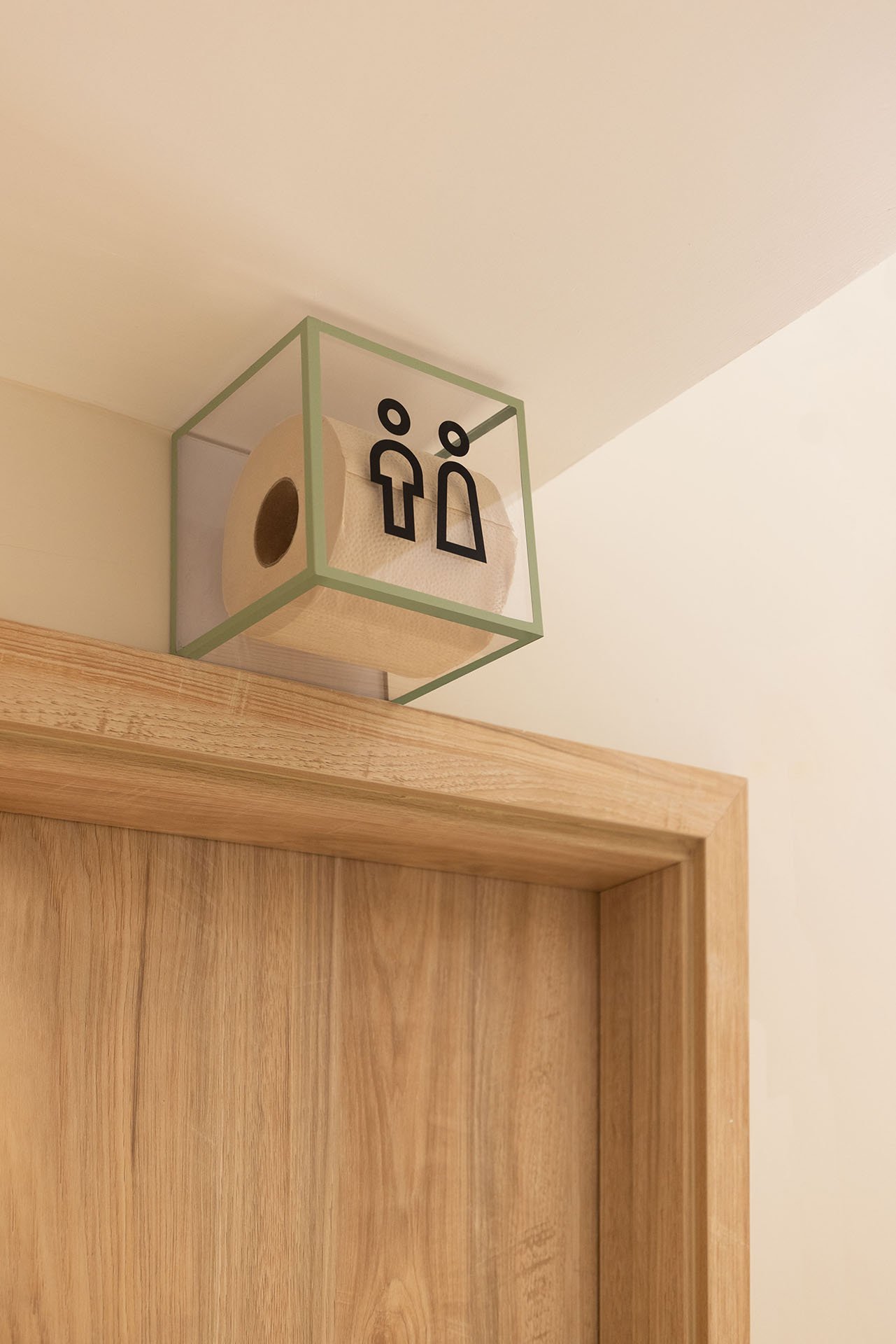
Whereas CLEAN- a sustainable Coffee & Laundry concept, we took inspiration from the ordinary graphics on laundry labels, and translated them into a set of distinctive identification signs that reflect the brand’s unconventional business model and playful personality.
Wayfinding- Cohesive, Impactful and Functional.
Well-thought-out wayfinding systems are essential to help users navigate inside/outside a space. Moreover, a good wayfinding system should also reinforce a brand’s visual identity. This is done by ensuring that the visual cues, such as the iconography, colours, typography, materials, and overall design style are consistent throughout. Functionality is also a crucial factor as the size, location and visibility all contribute to a better user experience.
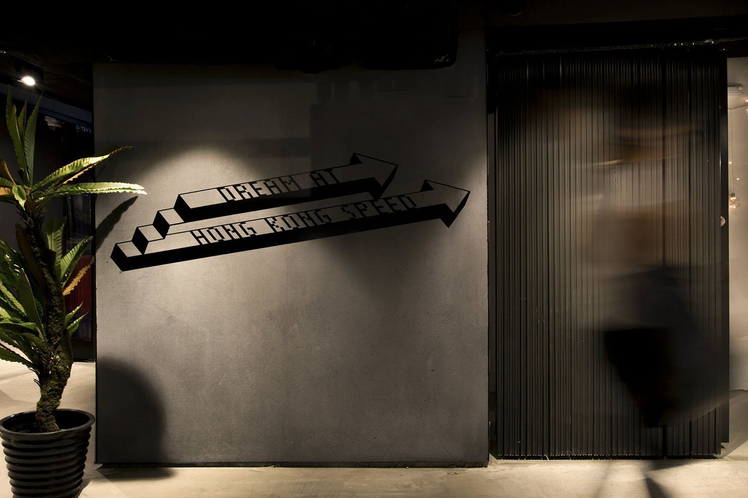
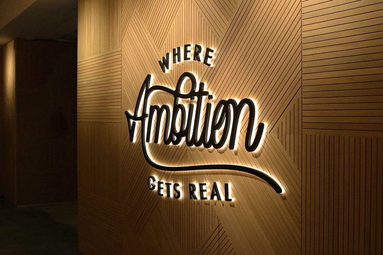
For Campfire’s coworking space, we created a series of wayfinding signage with bespoke environmental graphics to enhance their brand’s identity. The brand's distinctive messaging are interwoven in everything from understated directory signs that blend in with the interior design, to LED directional signage. These directional signs allow guests to participate in the brand's inspirational journey as they explore the space.
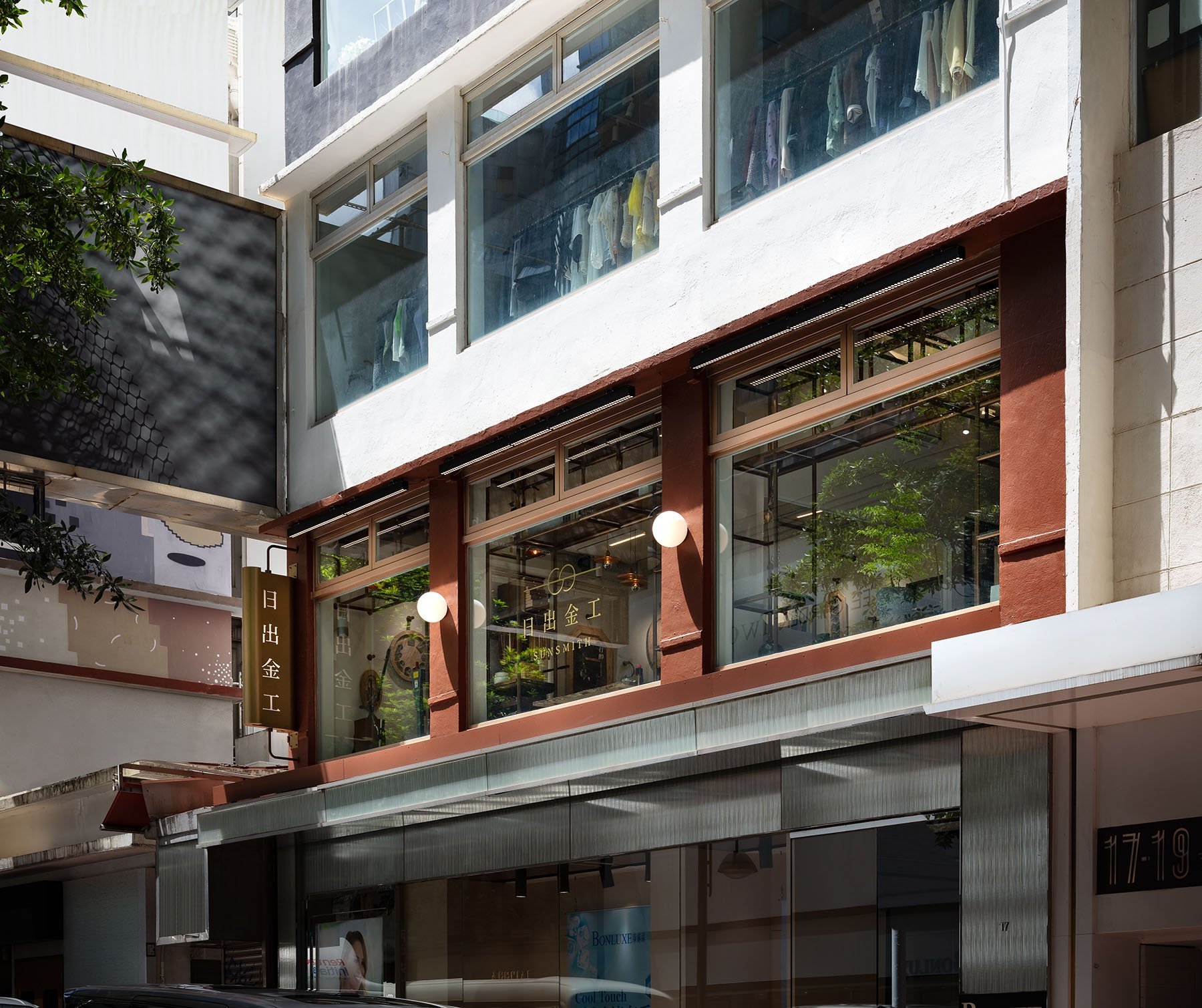
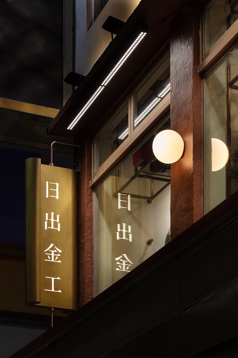
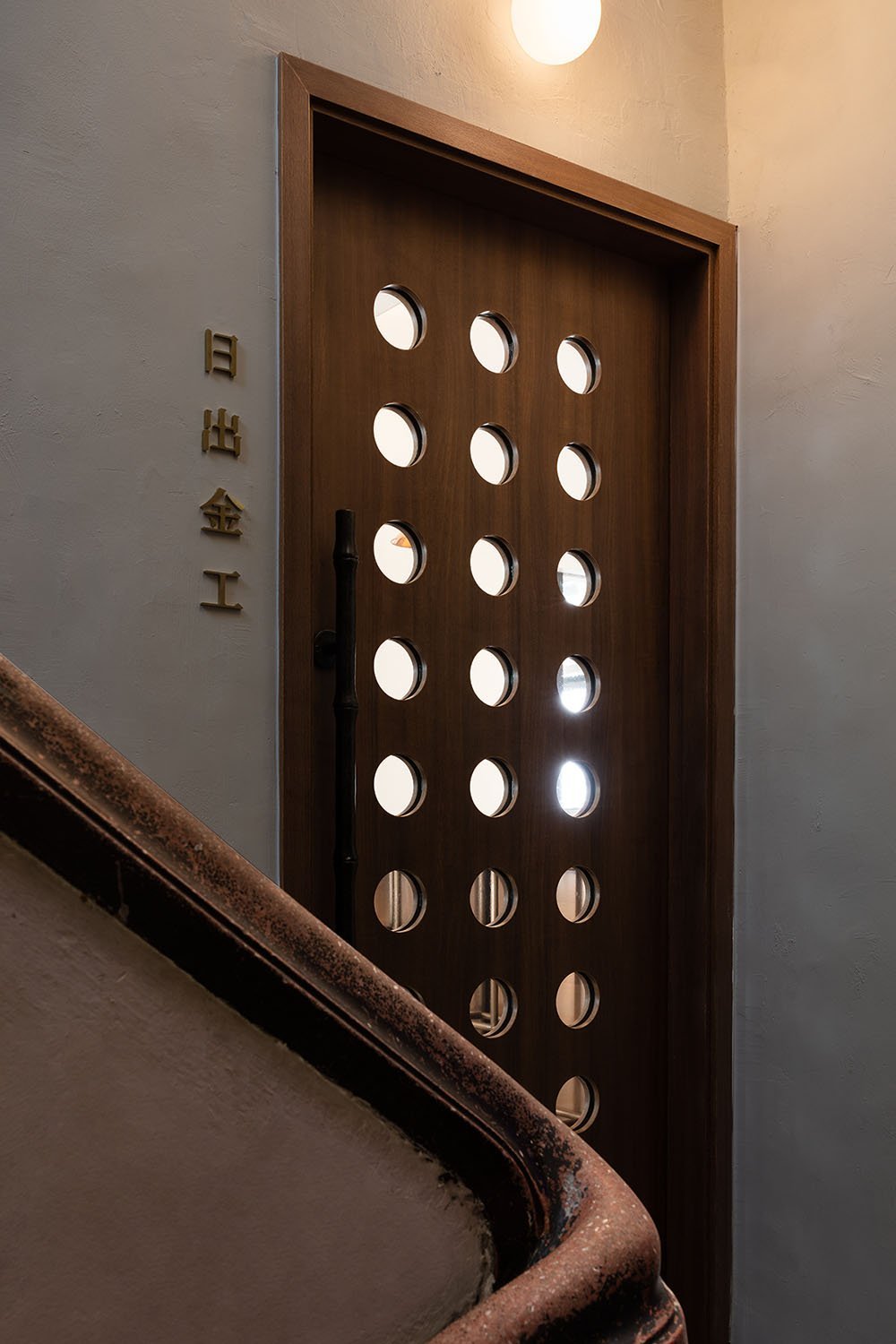
When it comes to successful wayfinding design, lighting is another crucial component. It can be employed as a design element as well as drawing users’ attention from a distance. For instance, the wayfinding signage we created for Sunsmith’s gallery and workshop, features glowing orbs that serve as both a guiding tool and a subtle nod to the company's name and brand mark. From the facade, to their first-floor entrance, and the other rooms in the space, each was strategically placed to provide users with a unified experience as they moved about.
Brand Environments- Creating “Pocket Moments” that can change a space.
Brand environments in the form of mural art, supergraphics, or signage feature wall, are all powerful tools for brands to communicate their backstory using the surrounding physical environment. It can evoke a range of emotions and can create what we call “pocket moments” within a space.
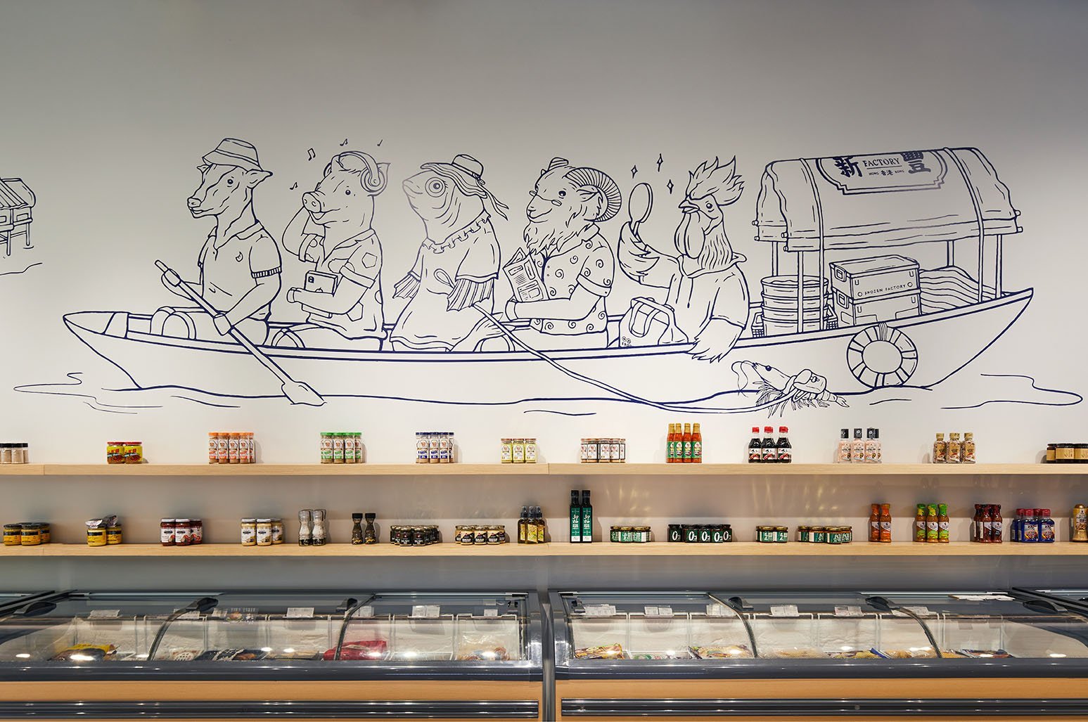
For example, our brand environment design for Frozen Factory- a family owned local frozen goods store was an exercise of purposeful authenticity. The brand’s local heritage can be seen through the thoughtful use of local design details. From the custom-made white shutter gates engraved with Chinese greetings, to the large scale mural that features the brand’s mascots riding on a ‘Sampan’ across the neighbouring Shau Kei Wan harbour.
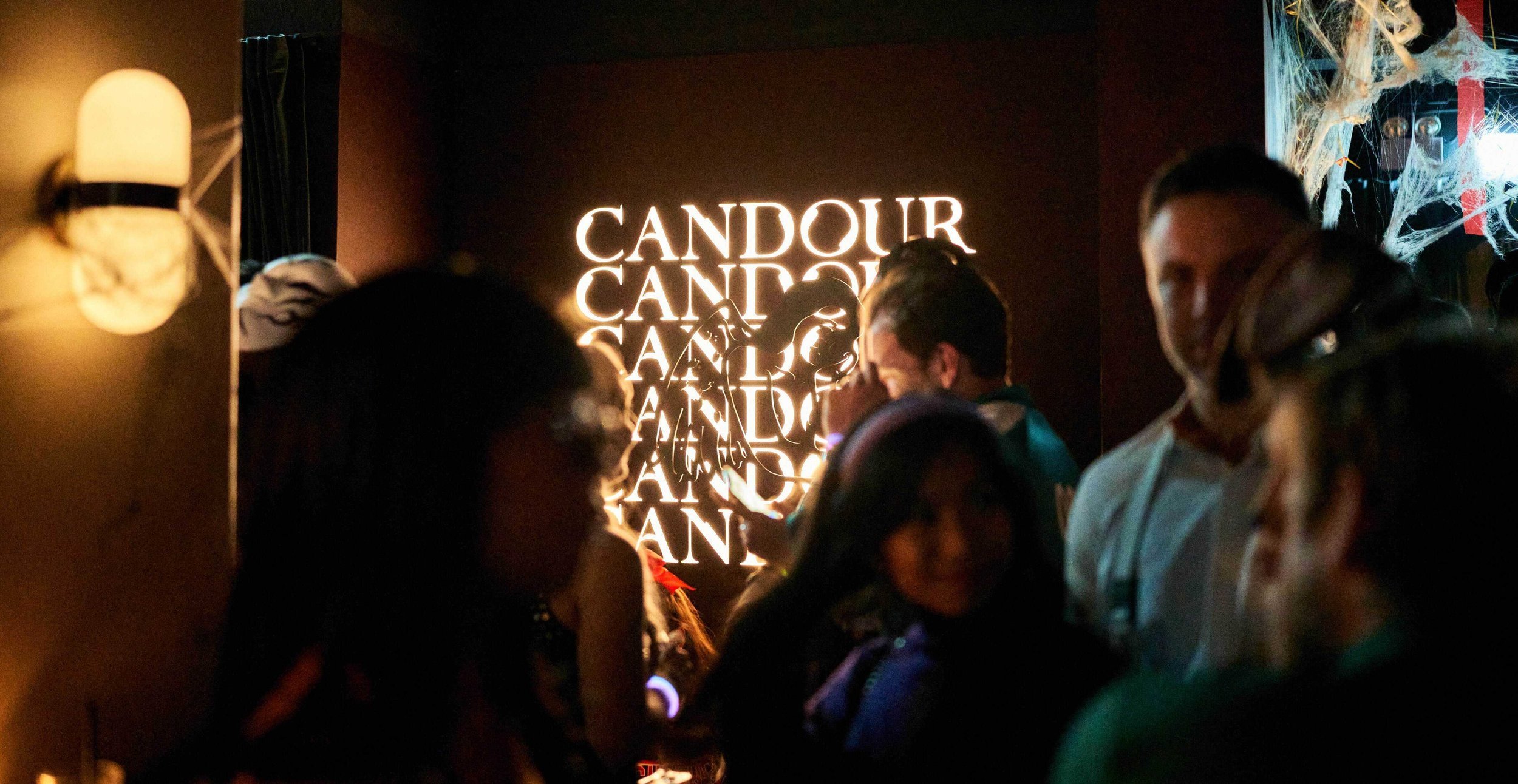
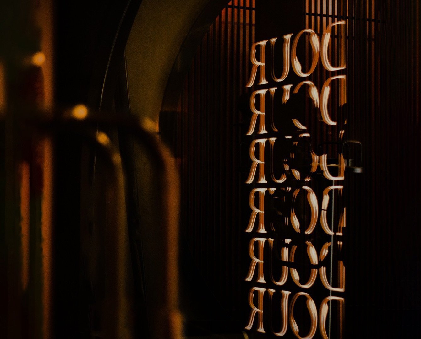
Another example is our brand environment signage design for Candour, a hip-hop bar & lounge concept at the heart of Hong Kong’s Soho district. Positioned behind the VIP lounge, our signage is a visualisation of the brand logo in repetitions made in back lit lettering. It illustrates the subversive and entrancing voice of the brand’s mascot that blends naturally with the interior space. The end product is an eye catching “pocket moment” within the space that brims with vibrancy and energy.
We hope you’ve enjoyed reading this article as much as we’ve enjoyed writing it. Subscribe below to receive exclusive insights into the world of bespoke design, or schedule a free consultation to see how we can help your business with signage design Hong Kong will remember.

